Worm: Reading For Everyone
This project focused on the human-centered principles of mobile UX design. I designed an interactive prototype of an eBook app, “Worm”, informed by user interviews and persona development and validated it with usability testing.
Spring 2023
Tools
Figma
Objective
“Design an eBook app that aids users in finding their next book to read”
Duration
6 weeks
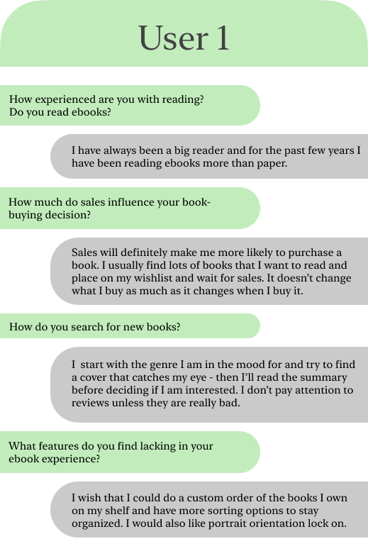
Conducting User Interviews
Key Takeaways
Pays attention to sales
Desires more control over the organization of their interface
Key Takeaways
Cares greatly about reviews
Prefers to have a menu / category display for their digital library
Desires a keyword search feature
Key Takeaways
Wants books that are guaranteed to be good
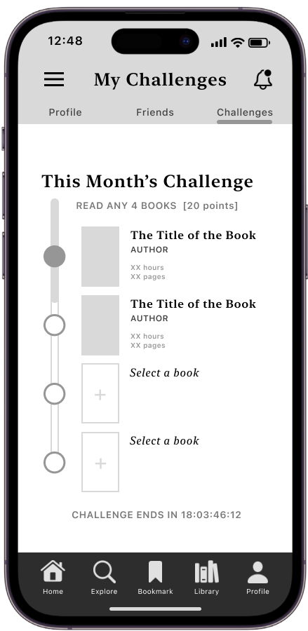
Wishes there was an eBook app that they could connect with friends on
Personas
These personas were used to help understand various user needs and expectations and ensure that they were being met throughout the design process.
Goals
Issues to Address
Poor search functions
Lack of community
Overwhelming amount of options
Inability to customize menu preferences
Features to Include
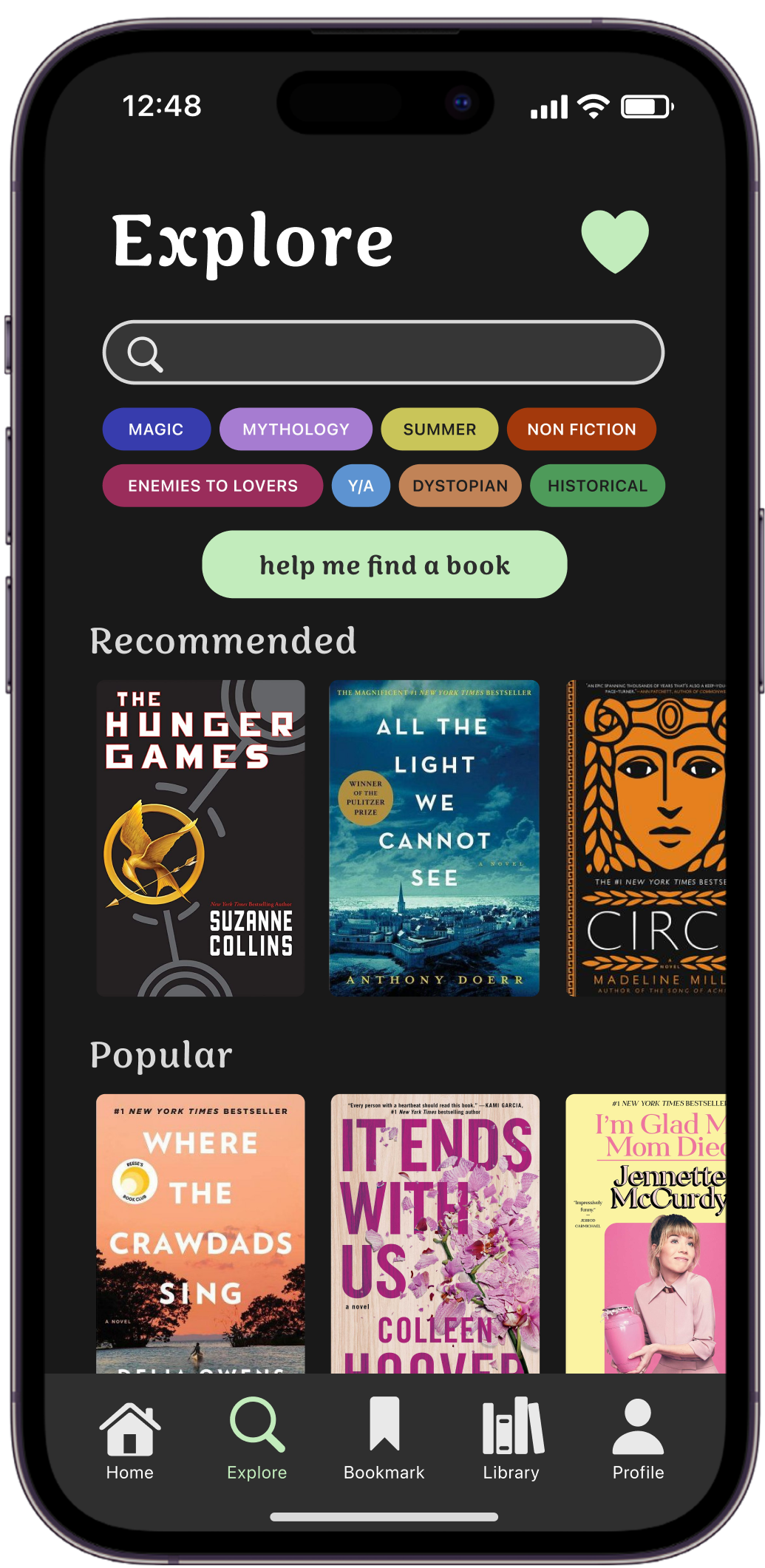
Tags to narrow down searches
Connect with friends on the platform
“Help me find a book” feature with recommendations
Information Architecture
With an idea of what features I wanted to include established, I laid out the information architecture of the app. This was a helpful visual aid while I was designing both the look and functionality of Worm.
Low-Fi Wireframe
Exploration and Iteration
After conducting interviews and receiving a round of feedback from other students, I refined my initial rough sketches. These changes included making the social aspect of the profile more interactive, simplifying the home page with image blocking, and providing a more detailed book description section. My aim was to make the interface simple, clean, and easily scannable while still having a good array of features.
Task Flow
Addressing the Main Task
To address the task of “help me find my next book to read”, I created a short quiz that can help various users gauge what they are in the mood to read and provide them with personalized recommendations. Even as a seasoned reader myself, I find myself stuck on what I want to read next, and this quiz is designed to help users of all experience levels, even giving them the option to see fewer options if they are easily overwhelmed or indecisive. This quiz is easily accessible at the top of the explore page and users can take it as many times as they’d like.
Mid-Fidelity Wireframe
For the mid-fidelity screens, I improved upon my sketches further to create a tangible application. The design is refined and consistent across each page and includes the screens that a user will view when completing user tasks. I kept a malleable vision to remain open to changes and ensure the final product met user needs.
Conducting Usability Tests
Notable Limitations
As a studio project, I had a lot of fun working on the different components of UX-based app design; however, functioning features such as “search” are outside of the scope of this assignment.
Worm UI
For Worm’s visual style, I utilized the typeface Sirenia as a display type. This typeface was quirky and friendly with rounded pseudo-serifs and a bookwormy feel. SF Pro is clean and simple, grounding Sirenia and allowing for information on the app to remain legible. The color palette is mainly neutral with Worm green as the design’s main accent color and an array of supporting colors for the tagging feature.


